This post was originally posted on Reddit after a user asked me for it on the r/HeroQuest subreddit, then I thought it would be good to keep it here on the blog too, also as a complementary post to the quick guide to paint HeroQuest.
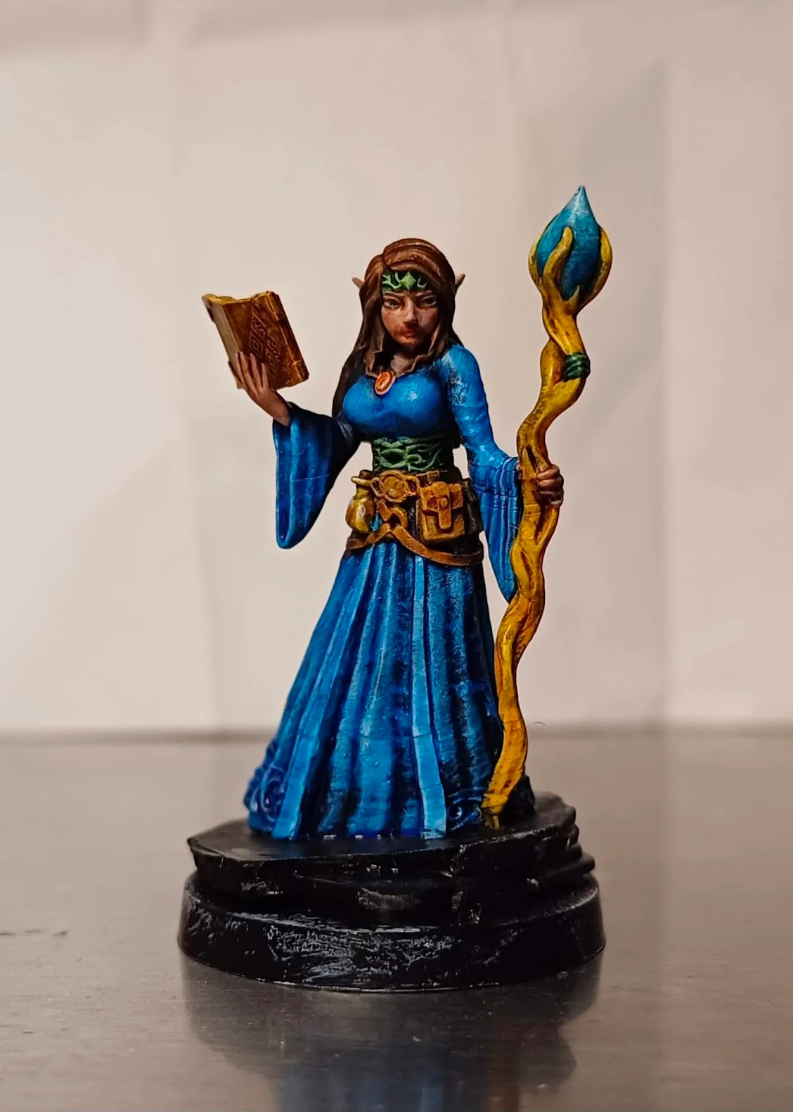
This is the finished mini:
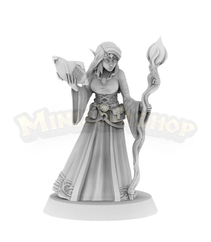
The mini I got was this same model, except for the base which was square, original HeroQuest style, and it was one with the model.
I have the new HeroQuest which has round bases, so I took a round 25mm base and checked how it went with the mini... and I hated it because the corners of the square base went outside the circle of the round base, so I simply clipped the corners (with regular pliers from my home toolbox) and ended up with a more than decent looking "broken dungeon floor" base. Yay!
I also glued the broken corner bits around, and also used some to tilt the figure a bit, as I thought it looked better like that.
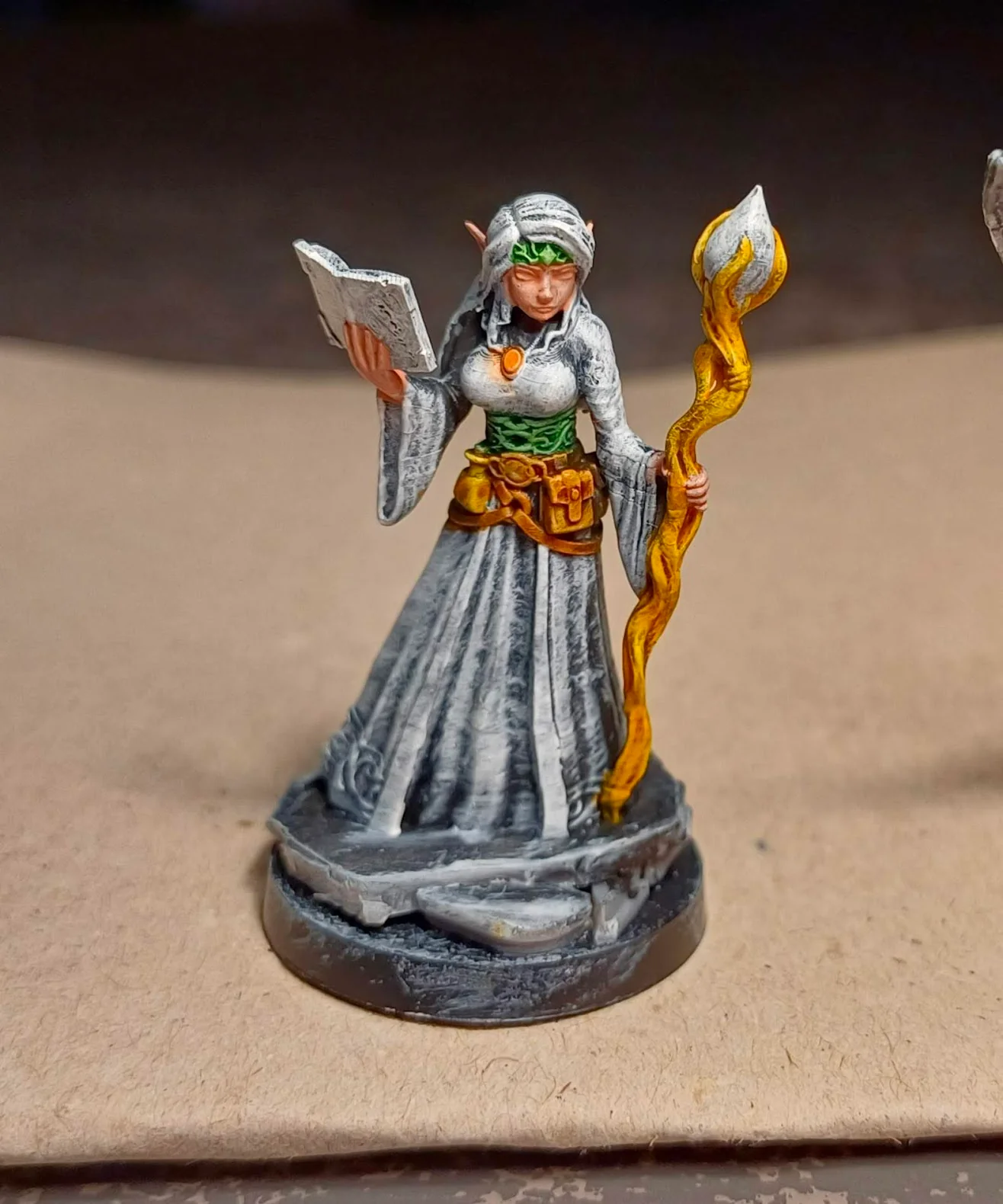
The following pic shows the mini after I primed it with a full layer of matte black (brushed on, with a "2" brush, because it's too cold and humid right now here to use rattle can primers), then a layer of dry-brushed grey and finally, when I was sure the grey was dry, a gentler layer of dry-brushed white. Both done in seconds with a cheap make-up brush, about 1/2" large.
The paints were Vallejo black, grey, and white surface primers.
This is the starting point of the "slap chop" technique. The dry-brushed grey-scale highlight makes it super easy to discern details, which is a boon to my limited sight.
Once the mini is ready, the most important thing I do is searching for image references of the model to take inspiration for the color scheme. For most miniatures, you can find plenty of images and see how other people painted the same model, which colors they chose, which details they focused on. For me, this step is VERY important, and really helps and speeds the whole painting job. Choosing colors as you go is generally a bad idea. Having a general plan for the main areas is really important.
And of course for this particular model I could not find a single pic :DDD
So I just googled "female elf wizard" just see some color combinations that I might like, and then decided to go for brown hair, blue dress, green tiara and corset, yellow staff, and light brown book, etc (you can see the finished model). So I decided for blue, brown and green, in short.
With a general plan for colors, I started the actual painting.
I use Vallejo Xpress colors, which behave pretty much the same as Citadel Contrasts, or Army Painter Speedpaints (minus the reactivation issues!).
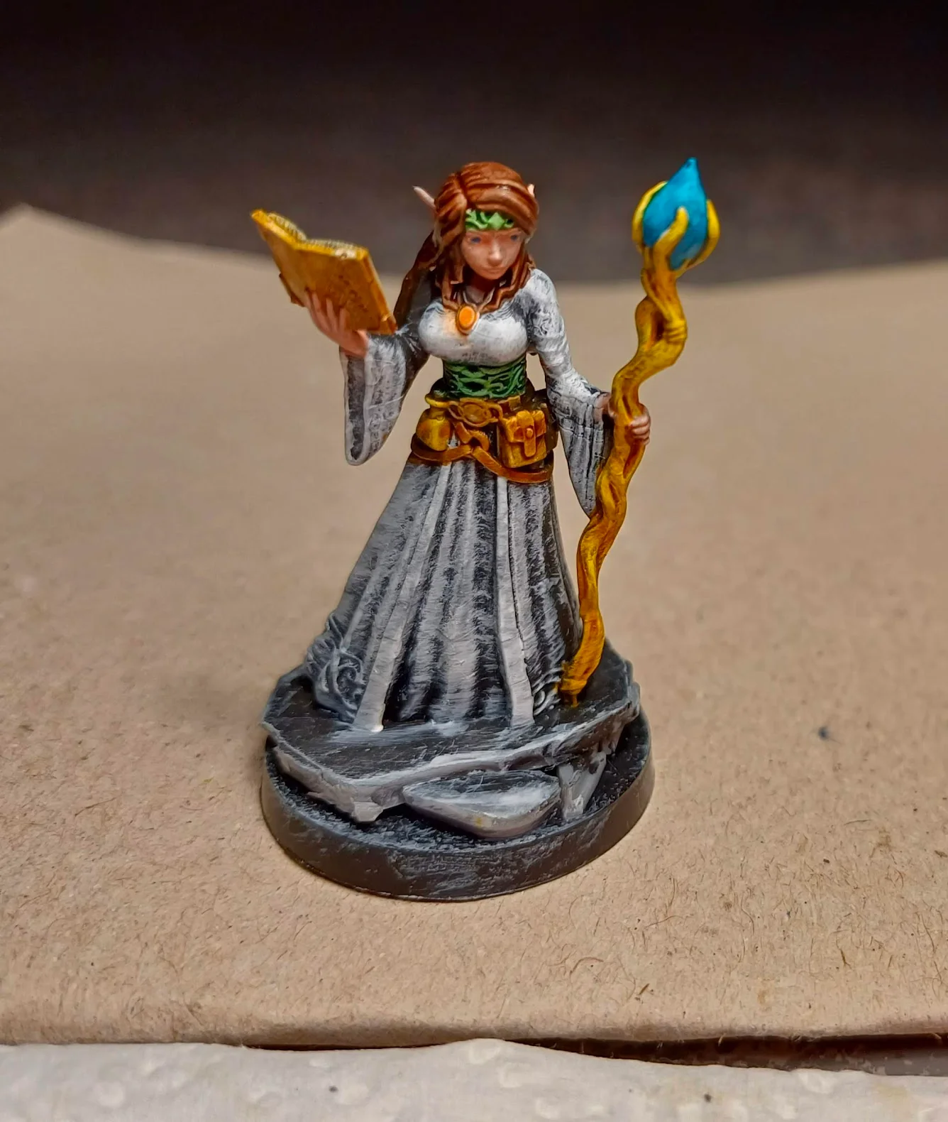
The pic below shows a simple layer of: Fairy Skin, Forest Green, Martian Orange (the jewel), Nuclear Yellow (staff and bottle), and Wasteland Brown (belts and pouch).
If you are not familiar with this kind of paints, in the pic you can see their magic at work: a simple layer creates a nuanced effect, which is further enhanced by the black-grey-white priming below.
You can also see I missed the small rings on the staff between the hand and the... garlic bulb or whatever it is.
I chose to start with those areas because I felt it would have been harder to paint them after the others.
The most common general advice is to paint as if you were "dressing" the mini, so start with the skin, then clothes, then details etc. I'm not really sure why I felt it was easier for me to start with those parts. Perhaps it was because I knew the rest was going to get a darker color?
As you can see above, some of the pink on the sides of the face went on the hair. Since I was going to use a dark brown for the hair, that little pink lines would be easy to cover.
I then painted Wasteland brown on the book cover, and Bag of Bones on the pages. Caribbean Turquoise for the "garlic" thing.
Next I panted the hair with Muddy Ground, and then decided to try the eyes. I guess I was lucky! Eyes are hard if you don't have REALLY steady hands, and are VERY experienced on how much color to load your brush with. I just used a small (000) brush with a hint of Caribbean Turquoise, and dropped a dot in each eye. That's it. Luckily, they came out really nice and straight-looking at the first try.
I chose to go with Forest Green on the second bottle (same color as the tiara and corset). This is important to me: trying to reuse the same color on different areas, so as to end up with a chromatic harmony. Too many different colors often produce a chaotic effect.
By this time, I was a bit tired so I didn't bother to check what were the exact hues of the blue colors I have, and chose my the name alone, so I went with Mystic Blue, which felt appropriate for the lady wizard.
Side note: This type of paints (Xpress, Speedpaints) often appear different inside the bottle from what they really end up looking when you use them on a mini. So I often use this image to check the exact nuance I want to use. (Not that I have all of them...)
The pic below shows I also painted the rings on the staff with the Mystic Blue. Due to their semi-transparent properties, the blue layer didn't completely cover the yellow, and so blue+yellow turned green.
...and this is about when thing could have stopped, frankly. It was looking good enough for me, but I still had some time, and didn't feel like starting a new mini. So I went ahead and applied Fluid Pink on the lips; two "c" lines of Plasma Red on the gem; and a gentle wash with Army Painter Strong Tone quickshade on the face and hands...
Then a gentle drybrush of white on the edges of the yellow potion and the upper part of the garlic thing; some dark tone quickshade on the book cover; metallic gold paint drybrushed on the belt and the book corners; and two tiny white dots on the c-shaped lines on the gem.
And that's it. Base still needs to be done but the lady is fine for me. You can always try and make things better, but I feel like this is more than enough for me. I paint minis for playing, not for display.
Final note: The slapchop technique greatly highlights details and in general is a boon; with this particular model, it has also highlighted some of the miniature's flaws. You can see a horizontal line on the gown and the sleeves, both on the front and the back of the model.


Thanks for the tips!
ReplyDelete